When I first started exploring the world of cryptocurrency, the charts looked like a confusing maze of lines, numbers, and patterns. It felt overwhelming, but I quickly realized that understanding these charts is key to making smart investment decisions. Whether you’re a beginner or looking to sharpen your skills, mastering crypto charts can give you a serious edge.
Understanding The Basics Of Crypto Charts
Crypto charts are essential tools for analyzing market trends and making informed trading decisions. They display valuable data on price movements, trading volume, and market sentiment.
What Are Crypto Charts?
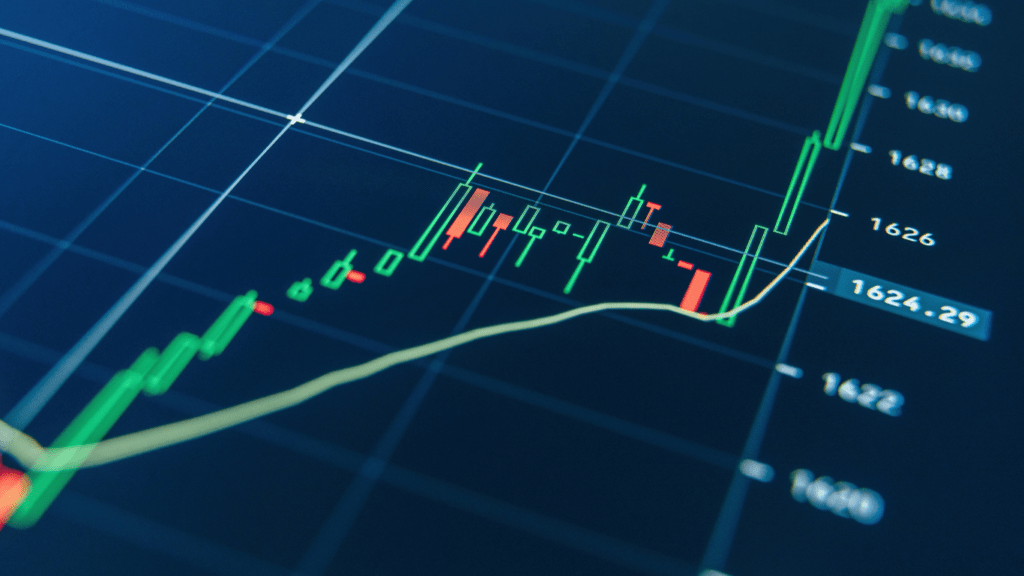
Crypto charts visually represent cryptocurrency price movements over specific timeframes. These charts use data points to display past and current market activity. Common chart types include line charts, bar charts, and candlestick charts.
- Line Charts: Show price trends over time by connecting closing prices with a continuous line. Useful for tracking basic trends.
- Bar Charts: Illustrate opening, closing, high, and low prices for selected time intervals. Offer more detail than line charts.
- Candlestick Charts: Highlight the same data as bar charts but with color-coded “candles” to instantly signal price direction. Popular among traders for detailed analysis.
Most charts include axes where the x-axis represents time, and the y-axis indicates price. Adding indicators like moving averages or RSI (Relative Strength Index) enhances analysis.
Why Reading Charts Is Crucial For Traders
Interpreting crypto charts allows traders to identify market trends and potential trade opportunities. Price patterns and volume changes often signal shifts in market momentum.
- Spot Trends: Traders can distinguish between uptrends, downtrends, or sideways movements based on past price activity. Staying informed about these trends aids in timing trades effectively.
- Evaluate Support and Resistance Levels: Charts reveal price levels where a cryptocurrency frequently reverses direction, helping traders predict future behavior.
- Assess Market Sentiment: Volume spikes or large candlestick movements often reflect increased interest or fear in the market. Monitoring these movements offers insights into buyer and seller activity.
When traders read these charts effectively, they gain a clearer picture of market dynamics, reducing emotional decision-making in volatile markets.
Key Components Of A Crypto Chart

Understanding key components of crypto charts ensures better analysis of price movements and market trends. Each element reveals important market data critical for informed trading decisions.
Price Candlesticks And Trends
Price candlesticks display an asset’s price movement within a chosen timeframe. Each candlestick represents four key values: opening price, closing price, highest price, and lowest price. Green candlesticks indicate price gains, while red ones signal losses. Patterns like “bullish engulfing” or “head and shoulders” reflect trends or potential reversals. For example, consecutive green candlesticks often highlight an uptrend.
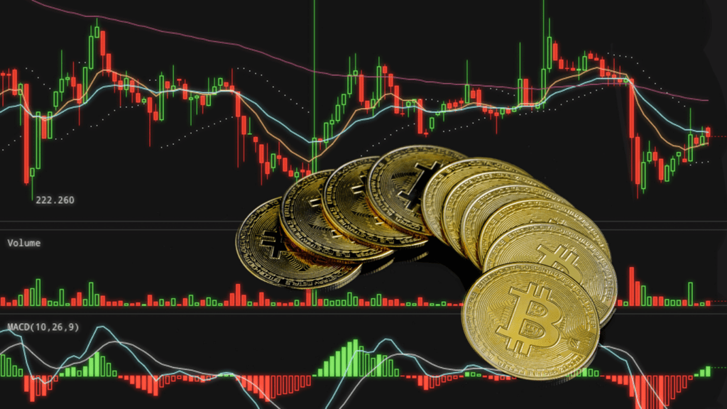
Volume Indicators
Volume indicators measure the number of traded tokens in a specific period. Higher trading volumes confirm strong market moves, while low volumes suggest indecision. A volume spike alongside a price increase often signals buying pressure, while decreasing volume during an uptrend may indicate a weakening rally. For instance, rising volume during a breakout reinforces its validity.
Timeframes And Their Importance
Timeframes determine how data points appear on crypto charts. Shorter timeframes, such as 1-minute or 15-minute, suit day traders seeking quick opportunities. Longer timeframes, like 1-day or 1-week, help swing traders or investors analyze broader trends. Each strategy relies on selecting an appropriate timeframe to match trading goals, ensuring better decision-making.
Types Of Charts Used In Cryptocurrency Trading
Understanding the different types of cryptocurrency charts is crucial for effective market analysis. Each chart type offers unique insights, helping traders develop a clearer picture of price movements and trends.
Line Charts
Line charts represent the most straightforward way to visualize price trends. These charts connect the closing prices of an asset across selected time intervals with a continuous line. For example, if observing daily trends, each point represents the closing price of that day. Line charts are ideal for identifying long-term market patterns, such as overall uptrends or downtrends, without being overwhelmed by short-term volatility.
Bar Charts
Bar charts provide detailed price action data for each time interval. A single bar displays the open, high, low, and close (OHLC) prices. The top of the bar indicates the highest price, the bottom represents the lowest, and horizontal tick marks highlight the opening (left) and closing (right) prices. By reviewing these bars, I can identify precise price ranges and compare how the market opens and closes over a given period. This format is particularly useful for evaluating intraday price fluctuations and identifying potential reversals.
Candlestick Charts
Candlestick charts combine functionality and easy readability, displaying the same OHLC data as bar charts but with color coding for clearer insights. Green candlesticks indicate price increases, while red candlesticks show declines. The “body” of the candlestick reflects the open-to-close range, and “wicks” (shadows) represent price extremes. Candlestick patterns—such as “doji” for potential indecision or “hammer” for a bullish reversal—offer additional context for market sentiment. I rely on candlesticks for versatile analysis, whether assessing short-term trades or forecasting long-term trends.
Essential Indicators And Tools For Chart Analysis
Indicators and tools are vital for interpreting crypto charts effectively. They reveal trends, momentum, and potential market reversals, helping traders refine their strategies.
Moving Averages
Moving averages (MA) smooth price data over a specific period to identify trends. Simple Moving Average (SMA) calculates the average closing price over a set period, like 50 or 200 days. Exponential Moving Average (EMA) gives more weight to recent prices, reacting faster to market changes. For instance, crossover between a short-term EMA and a long-term EMA can signal trend shifts.
RSI (Relative Strength Index)
RSI measures the magnitude of recent price changes to indicate overbought or oversold conditions. An RSI above 70 suggests an asset is overbought, while below 30 signals it’s oversold. For example, if Bitcoin’s RSI falls below 30, it could imply a buying opportunity. Traders often use RSI with other tools to confirm signals.
MACD (Moving Average Convergence Divergence)
MACD evaluates momentum by comparing two EMAs (typically 12-day and 26-day) and uses a signal line (9-day EMA) for crossovers. When the MACD line crosses above the signal line, it indicates bullish momentum. A crossover below the signal line suggests bearish momentum. The histogram, showing the difference between the MACD line and the signal line, helps visualize these shifts. For instance, widening bars in the histogram reflect increasing momentum.
 Blockchain Tech Contributor